CSS Grid Column Repetition
Grids can structure your UI effectively and used in the right context they provide a great user experience. In this article I'll show you how you can utilize CSS grids to make the elements sized equally, with a fixed gap, and a flexible row number that varies in relation to the container/window size, the number of elements and the configured target elements size.
A brief overview
CSS grids implement a 2-dimensional grid system where the developers are able to place their objects onto a grid which also is able to behave in a responsive way. This means that it can change it's column order, it can wrap, etc. You can use grids to define a grid template and place elements exactly where you want them to show up.
This article demonstrates how to implement a floating grid system. The result will behave like in the following animation that I implemented for my old website.
The HTML template
The first thing we create for this demo is the list of elements placed inside of a container.
<div class="grid-container">
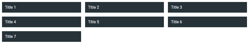
<div class="item">Title 1</div>
<div class="item">Title 2</div>
<div class="item">Title 3</div>
...
<div class="item">Title N</div>
</div>
In order to make the grid-container a grid, add the following CSS:
.grid-container {
  display: grid;
}
That, actually, was really simple. All the direct childs automatically are now grid items. But in order to specify our grid we need to dive in a little deeper. Lets define the columns. In future code snippets I will not repeat the CSS properties. Take it as "added to the style definition".
.grid-container {
  grid-template-columns: repeat(auto-fill, minmax(256px, 1fr));
}
That's a little more complicated but lets go through it step by step. The CSS property to define the columns is grid-template-columns. There are other grid properties as well, but lets concentrate on this one first. The repeat function simply says repeat as long as "conditions are valid". So there can be multiple columns defined on the function parameters. The auto-fill tells the function to fill the entire width of the container with entries that are at least 256px wide and at a maximum 1fr (one fraction) wide. But what does that mean?
The CSS grid container tries to fit as many 256px entries into that column. If there is a fraction left, the entries will be stretched to fill the entire space. E.g. the container is 540px wide, then there fit in two 256px entries, and the rest is 28px. Then the entries will have a width of 256px + 28px / 2 = 260px.
In order to beautify the grid we use a property called grid-gap. This property adds a gap between all grid items.
.grid-container {
  grid-gap: 16px;
}
Note: This gap is also available for flex as gap which turns out to be really handy. I use it a lot. Let's paint the
grid entries, add a padding
.item {
  background-color: #263238;
  color: white;
  padding: 12px;
  box-sizing: border-box;
}
And here it is, the response CSS grid
The CSS function grid-template-rows: repeat() supports all common browsers
except for Internet Explorer. You can read more about it at the MDN docs for
repeat or at caniuse.com